
This tutorial will demonstrate how to create a business card template using Inkscape. The steps in this tutorial will work for Inkscape versions 0.46 and 0.47.
Creating The Template
Importing the PDF template
For the purposes of this tutorial, the stock for our business cards we will be the Worldlabel 3.5″ x 2″ Business Card.
Download the PDF template from the Worldlabel website: https://www.worldlabel.com/Templates/wl-ol244PDF.htm.
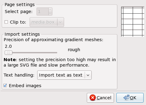
Launch Inkscape, and open up the PDF template using the File > Open... menu item. After opening up the file, the PDF Import Settings dialog box will appear. As illustrated below, use the default settings and press OK.
PDF import settings
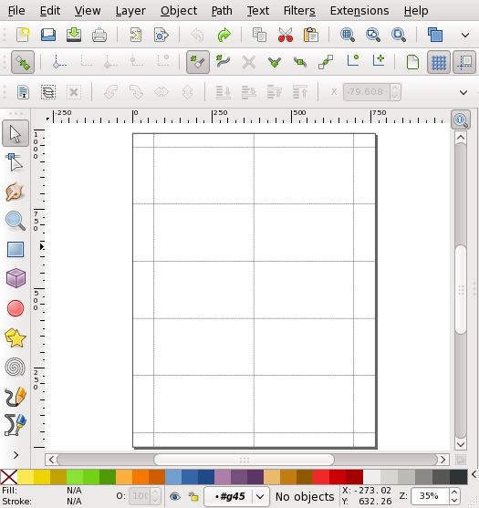
Your document should now have the template visible, similar to the image below. Now, go to File > Save As... and save your document in the native Inkscape format, SVG (Scalable Vector Graphics).
1.2. Converting to Guides
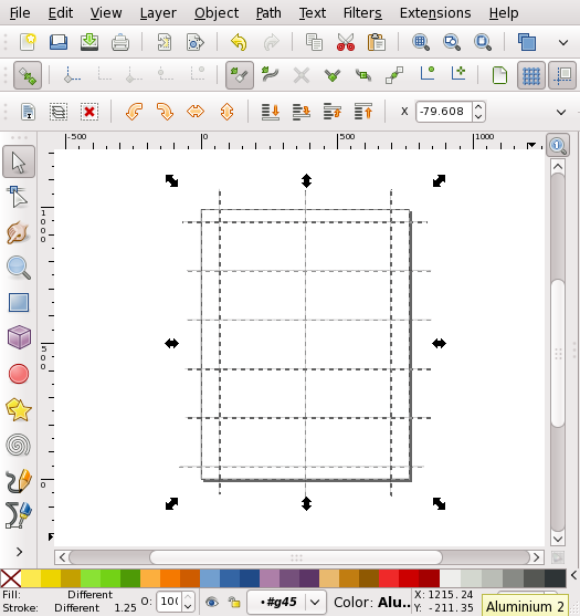
The next step is to convert the lines that make up the template into Inkscape guides. The template object that was imported from the PDF may be in a group. To convert the template to guides, we first need to ungroup the lines that make up the template. Go to Edit > Select All to select all the objects, then choose Object > Ungroup twice. The document should look similar to this:
Now, keep the lines selected, and choose Object > Objects To Guides from the menu. The original black lines have now been replaced with blue guide lines:
The next step is to double check the Inkscape’s snapping preferences.
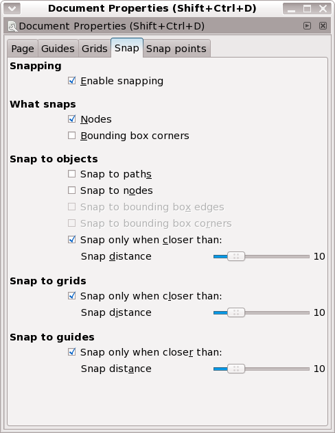
1.3.1. Configuring Snapping for Inkscape 0.46
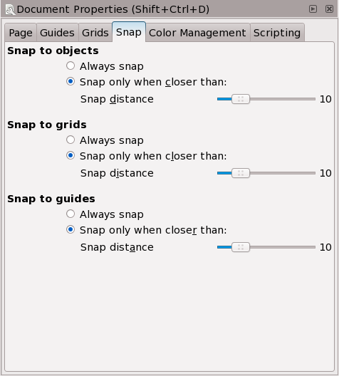
Open up the Document Properties dialog by going to File > Document Properties... in the menu. Select the Snap tab and configure the preferences as per the screenshot below:
With these preferences configured properly, when an object is moved or resized near the guides, the object should “snap” cleanly to the edge of the guide(s).
1.3.2. Configuring Snapping for Inkscape 0.47
Open up the Document Properties dialog by going to File > Document Properties... in the menu. Select the Snap tab and configure the preferences as per the screenshot below:
The main difference in Inkscape 0.47 is that a Snap Controls Bar was introduced. It is essentially a bar of toggle controls that control the snapping options. Having the buttons toggled as per the following screenshot will create the snapping behavior needed for this tutorial:
1.4. Creating the Rectangle
- Select the
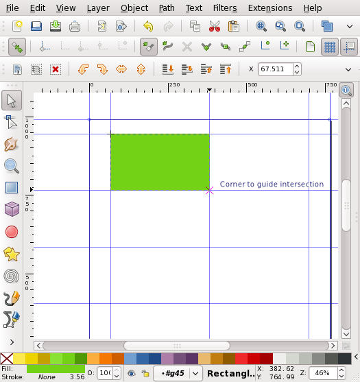
Rectangle toolfrom theInkscape Toolboxon the left hand side of the main Inkscape window. - Draw a small rectangle on the canvas within the guides of the top left Business Card area of the template.
- Choose the
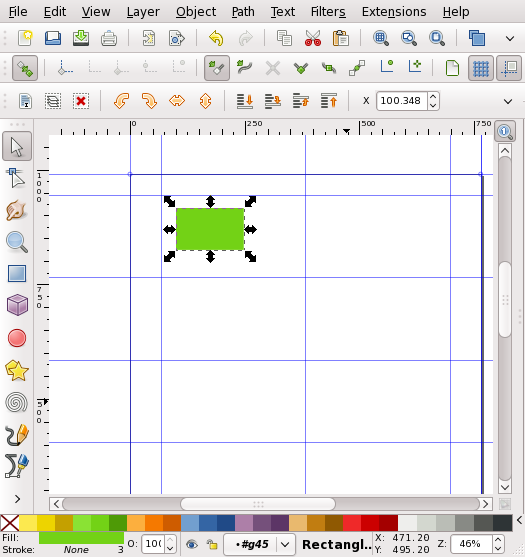
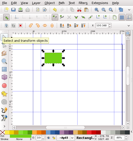
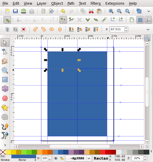
Select toolfrom the tool box, and select the rectangle that you drew with it. The rectangle should have arrows around it like the following screenshot: - Resize the rectangle to fit the business card shape defined by the guides. While resizing, the rectangle should automatically snap out to the inner edges of the guides.
- For the clones that we are going to create to function properly, our rectangle needs to be in a group. Select the rectangle using the
Select tool.Now place the rectangle into a group with Object > Group from the menu. The statusbar at the bottom of the Inkscape window should now read:
Group of 1 object in layer OL244. Click selection to toggle scale/rotation handles.
- Select the rectangle (which is actually a group), and create a clone of it using
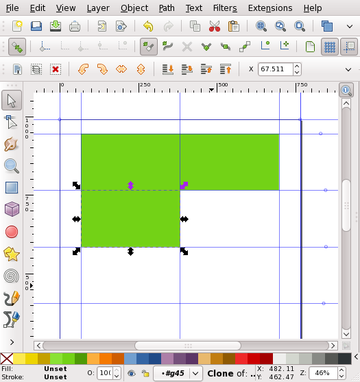
Edit > Clone > Create Clonefrom the menu. This will create a linked clone of the object. Make sure the clone is selected by checking the statusbar for the following message:Clone Of: Group of 1 object in layer OL244. Use Shift + D to look up original.
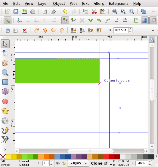
- Now move the newly created clone to another business card slot on the template. The clone should snap cleanly into place:
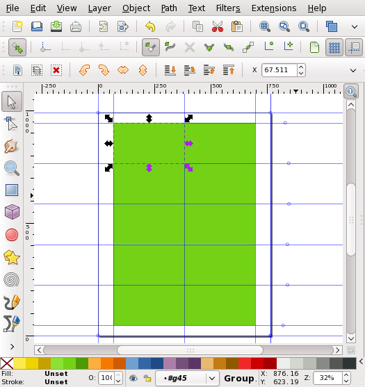
- Go back to the original rectangle that was created, and repeat the cloning process until all 10 slots of the template have rectangles in them. Try to always keep the original rectangle in the top left slot of the template.
When you have finished this step, the document should look like the following screenshot:
- Now check that the clones have been created correctly by entering the group, and changing the color of the rectangle. First, select the original (it should still be in the top left slot) and double click on it to enter the group. After double clicking, the selection cues (the bounding box and arrows) will disappear. Click on the rectangle again and the statusbar message should have changed to: (the “#G1234” value will be different):
Rectangle in layer #G1234
Now change the color of the rectangle using the palette at the bottom of the screen. If the clones have been created properly, the color of every object should change automatically.
2. A Sample Business Card Design
The second section of this tutorial will outline a sample process for using the newly created template to Design a Business Card.
2.1. Creating the Background Gradient
As was done in the final step of creating the template, select the original (it should still be in the top left slot) and double click on it to enter the group. After double clicking, the selection cues (the bounding box and arrows) will disappear. Click on the rectangle again and the statusbar message should have changed to: (the “#G1234” value will be different):
Rectangle in layer #G1234
Now, select the gradient tool from the toolbar:
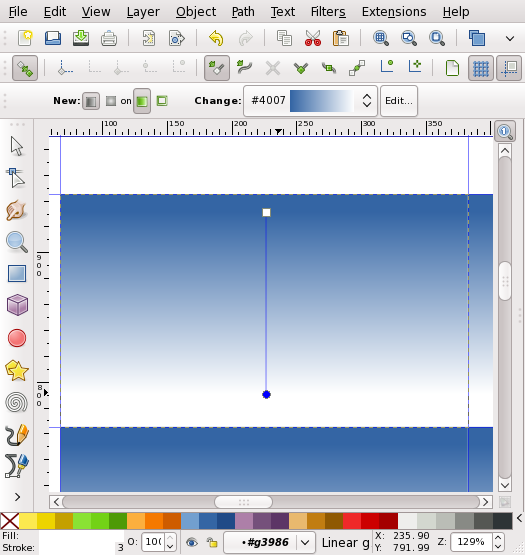
Now, click and drag a line on the rectangle, creating the gradient:
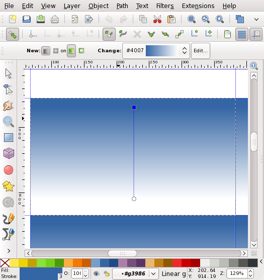
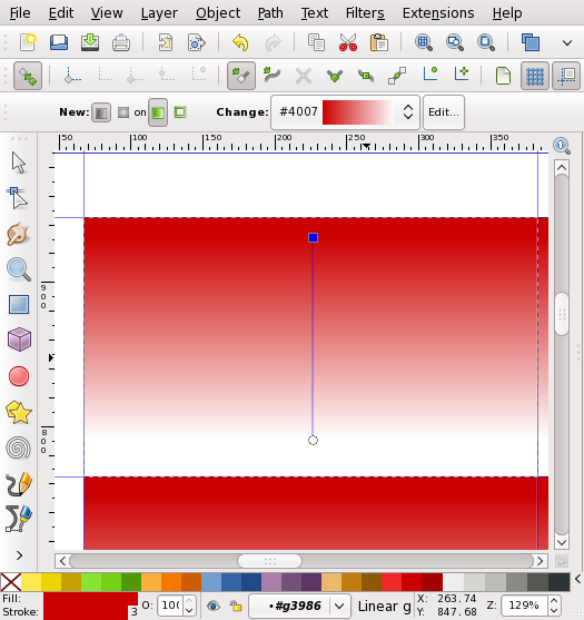
Click on the top node of the gradient. (This selects the node, making it blue like the screenshot below).
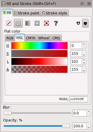
Open the Fill / Stroke dialog (Object > Fill / Stroke from the menu), and choose the fill color for the top node of your gradient. (in this example, the color that is used is #cc0000ff)
The gradient color will have changed:
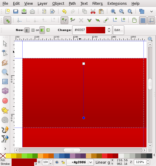
Follow the same process, and change the color for the bottom node of the gradient (in this example, the bottom color that is used is #a40000ff). The canvas should look like:
2.2. Creating the Background Pattern
In the next step, a striped background pattern will be added to the business card.
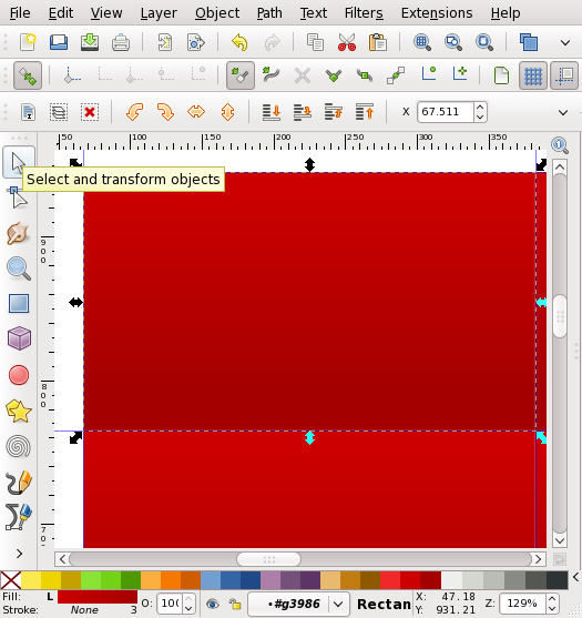
Choose the select tool from the tool bar:
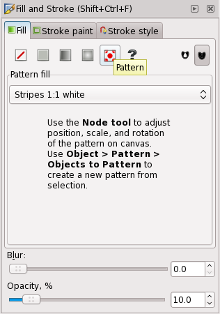
Next, duplicate the rectangle (Edit > Duplicate from the menus), and open the Fill / Stroke dialog again. In the Fill / Stroke dialog, choose the pattern fill type, and set the pattern to “Stripes 1:1 White”. In the same dialog, set the “Opacity (%)” slider at the bottom to 10%:
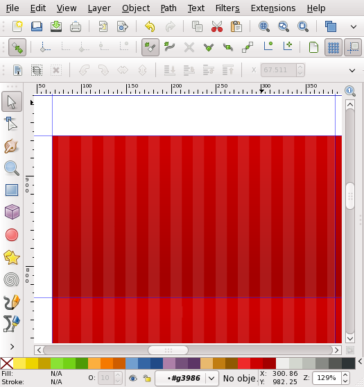
The result will look similar to:
2.3. Adding Text
The final step in the business card design is to add text.
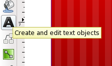
Select the Text Tool from the side Toolbar:
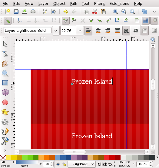
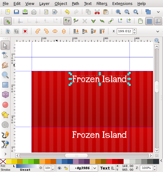
Click once on the canvas to insert an unflowed text object, and type in some text.
After entering in the text, choose the select tool, and use the arrows that surround the text object to resize it.
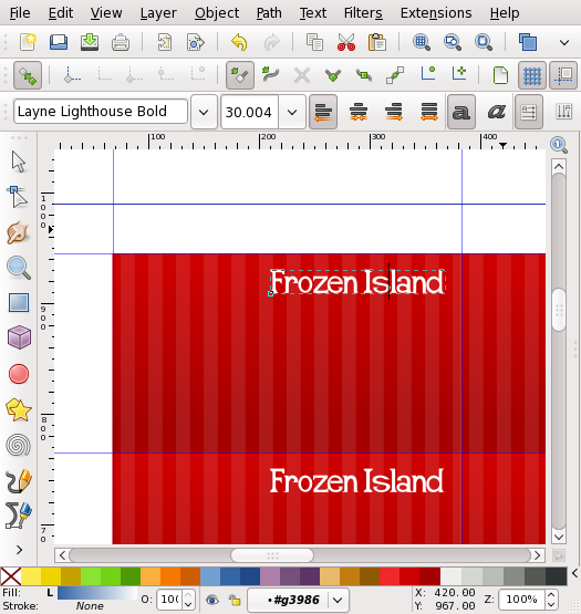
The letters in an unflowed text object can be manually kerned. Choose the Text tool again and place the cursor between the letters that need to be moved. Next, hold down the ALT key, and press an Arrow key. Use this technique to manually fine tune the position of the letters:
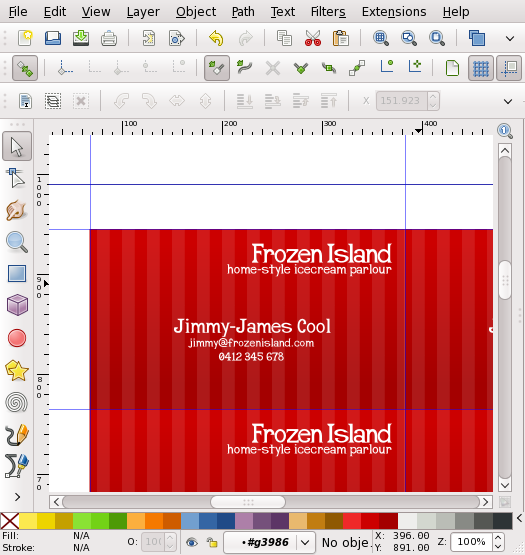
Repeat this process to add multiple text objects to fill out the business card:
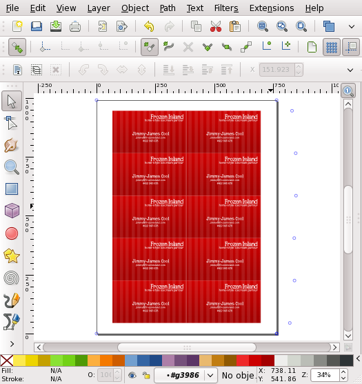
Finally, zoom out, and admire the finished business cards, ready to be printed.
Author is Ryan Lerch of http://ryanler.wordpress.com/


This is a great contribution for the Inkscape tuts and is very impressive!
This is the very first Inkscape tutorial I have ever been able to follow from start to finish, and achieve a great result. Thanks very much for a smashing explanation of all the steps!
Like Kat, this is the first Inkscape tutorial I’ve completed. This has saved me tons of time getting to know tools I’ll use again and again. Thank you!
This was a terrific tutorial to get me off and running with Inkscape. Thank you very much for sharing it with us! I for one greatly appreciate it!
Best,
John
Thanks, my first tutorial and it worked well
Hi,
Thank you for this tutorial.
However, I must be missing something because I’m stuck at the step where you add the whites strips. When I Duplicate the first frame and add the pattern, the other frames are not updated with the pattern. Same thing with the text.
Yet I’ve done every steps before just as you describe them…
Do you have any clue?
I may need this method to help an association to do adress labels quickly…
Thanks in advance.
Pingback: Inkscape 0.47 Totally Solid with Lots of New Tools | Worldlabel Blog
Pingback: Inkscape – A noteworthy open source vector graphics software
Now this is what I called a very useful tutorial.
I really needed that.
Thank you very much.
Pingback: Business Card Design Starter Kit: Showcase, Tutorials, Templates - Smashing Magazine
Thanks so much for the help Ryan! The conversion of the pdf to a guide was great! The part about double clicking the grouped source rectangel BEFORE adding the gradient saved me and I’m sure many others from a lot of frustration!
Thanks Again!
Thank you so much! This tutorial is excellent. Great use of tools and techniques!
Thank you for this tutorial. I answers my questions on business cards and inkscape. Just perfect.
I would have never guessed that one could use a pdf template in InkScape. This point alone will enable so many with so much more. Totally awesome and insightful — stupendous.
Excellent tutorial and thanks for the template!
Pingback: Inkscape – A noteworthy open source vector graphics software | Inkscape – A noteworthy open source vector graphics software how to linux | Inkscape – A noteworthy open source vector graphics software > | How to Linux, Linux Help, Ubun
Tnkz for this excelent tutorial! Easy to follow and great results 😉
Could be great if a second “medium” level bussines card tut hit the site 😀
Cheers
great tut, thanks much. Just one question – I duplicated the original and followed the steps, so now I have the orig and a dup in the top left. at the end – do we ever delete that duplicate?
thx.
looking forward to more tuts!
dee
Thanks. I’m new to Inkscape so this tute has helped me out. Plus I’d like 20 biz cards for all occasions.
This is so great, I can follow each instruction, thank you so much. I have a question for you, is it possible for you to show me how to place two hearts on a piece of card stock, and only cut the two hearts at the sides and not cut the whole heart. This is to be cut on a cricut expression, but if i place the hearts on the card stock the cricut will cut out the whole heart, all i want is for the sides to have a slit, so that a piece of ribbon can pass through. Please help me i am not seeing and tutorials on this.
Thank you so much, very clear and easy to follow. looking for other tutorials like this…
beautiful! I am so happy with the result. I chose the old paint pattern and a slightly darker red color. Anyhow, this is one of the best inkscape tutorials i’v seen. Thank you!!
Great Tutorial!
Thanks for taking the time and posting this.
I cannot set the rectangles to not print the outward borders.
The result is that they don’t coincide with the perforations on the business card sheets.
How can I set these guides to not print?
I could design the cards, but could not print them. I have no color printer at home and could not convert to pdf without cards changing size
Thank you much this tutorial was very helpful. A really good resource!!!
Hi there,
I am brand new to Inkscape and must be completely missing something!
Please could you tell me how i ensure, when working on business cards, that the text i type in the first main card flows to all the other cards?
I can’t seem to work it out!
Thanks so much…
Great tutorial.
Thanks.
Excellent instructions! Absolutely perfect in direction! You are a helpful individual.
Thank you, thank you! As the rest have commented this tutorial was so helpful! Wish there were more like this one.
Thank you,u r great
thank you very much for your teaching and sharing.
Pingback: 10 of the Best Inkscape Tutorials | inkscape tutorials blog
Pingback: 55 High Quality Business Card Tutorials And PSD Templates You Cannot Miss – 【莆田涵江电脑培训第一品牌】
That was what I was looking for, great.
Thanks.
Great tutorial. I learned a lot. If possible, can you post the x, y, w, h of the primary card. I have x: 67.511px, y: 764.990, w: 325.105, h: 180.021 .
I wasn’t able to get the “snap to guides” to work for me (only on the first one when I drew the rectangle from corner to corner). When I zoomed in on the cards initially I saw whitespace at many of the edges so I tried the align tool which worked on the right column but not the left. When I switch to inches, I always get 3.501 by 2.000 dimensions which I guess is OK. Your original template is exactly set to a 3.5 x 2.0 card so I imagine Inkscape is just a little quirky sometimes. Thanks again. for a great tutorial!
I think everyone would love to see a tutorial on preparing this artwork for a commercial printer. That’s the “Ark of the Covenant” tutorial!!