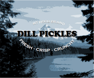
One of summer’s pleasures is its abundance of fresh fruits and vegetables. If you’re the grower, then along with the joy of eating summer’s bounty is the responsibility of making sure nothing goes to waste. Because we often harvest more than we can eat, canning is a common way to store summer foods for use later that year. After all, who doesn’t love receiving a nicely wrapped can of home-grown tomatoes or a jar of fresh strawberry jam?
For home canners with modest graphic design skills, such gifts can be easily enhanced by the addition of custom labels. Following in the fine tradition of labels from the past, designing your own label is simple to do and adds a lot when personalizing your presentation.
A few years ago while visiting my friend Tom Sims in Portland, Oregon, I was asked if I could help design a label for a batch of garlic dill pickles he was putting up. Figuring I’d be repaid in crunchy dills, I jumped at the opportunity.
Choosing the Label
The first step is to make a quick survey of possible labels, and choose the one best suited for the job. For this project I chose World Label’s WL-OL150 shipping labels, which measures 4 x 3.33 inches. My next step was to do some research on the history of fruit labels. Typing “Vintage fruit labels” into Google’s search field brought up hundreds of images of old-time labels. After a quick study of the genre, I was ready to begin designing Tom’s label.
I decided that a picture of Oregon’s famous Mt. Hood would make a great visual for the pickle label. For the image I went to my favorite source of free images, MorgueFile.com. There, I found just what I was looking for (Figure 1).

Figure 1: this photo of Mt. Hood and Lost Lake would be perfect for my label
To make the Mt. Hood image match the style of those vintage labels I’d seen, I used a Posterize adjustment layer in Photoshop. Posterize takes the millions of colors we normally see in an image and converts them to a handful. For the Mt. Hood image I experimented and found that eight levels of color worked best (Figure 2).
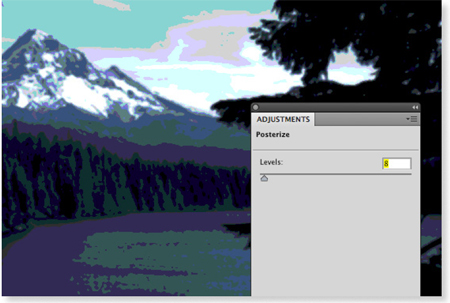
Figure 2: Posterization of Mt. Hood
Afterward, I softened the entire effect by applying a slight Gaussian Blur. Before applying the blur I converted the layer to a Smart Layer by choosing Filter > Convert for Smart Filters (Figures 3 and 4).

Converting an image for Smart Filters turns it into a Smart Object. Smart Objects keeps a non-destructive copy of your file in its original state, which allows you to adjust the intensity of a filter (in this case the Gaussian Blur) even after the file has been saved, an important step when making creative choices.
Building the Label
Next we’ll build one label in InDesign using our posterized image of Mt. Hood and Lost Lake. In InDesign go to File > New > Document. In the New Document dialog box, create a document that’s the size of one label in the WL-OL150 World Label template (Figure 5).
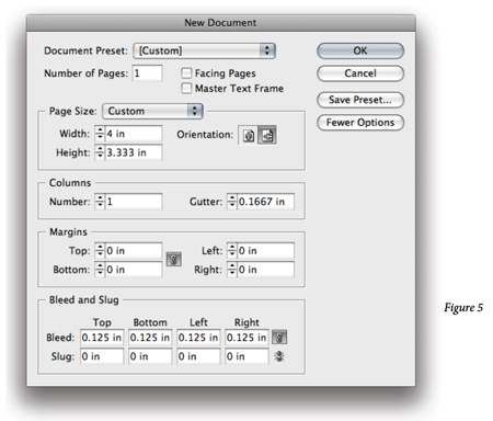
Format your type and label size
According to information on the website, the dimensions for each label are 4 in wide by 3.333 inches high.
Once you’ve created your document, choose File > Place from inside of InDesign, and navigate to the posterized file named Lost_Lake.psd. With the image loaded in the InDesign place gun, click once to place the image on the page at 100-percent size.
Afterward, use the standard InDesign tools (black and white arrows) to move or scale the image into proper position on the page.
Add the Type
After the image has been placed and scaled into position, it’s time to add type Click and drag with the Type tool (press letter T on your keyboard to access the tool) to create a text frame. With the text cursor blinking, type in whatever information you want to appear on top of the background image
Format your type using InDesign’s standard type formatting tools for fonts, size, leading, and alignment (Figure 5). For a more detailed explanation of these tools refer to page 50 in my book, Professional Design Techniques with Adobe Creative Suite 3 (Adobe Press, 2008). Take advantage of the Optical Kerning feature of InDesign to insure that letter spacing is even and consistent throughout your type.
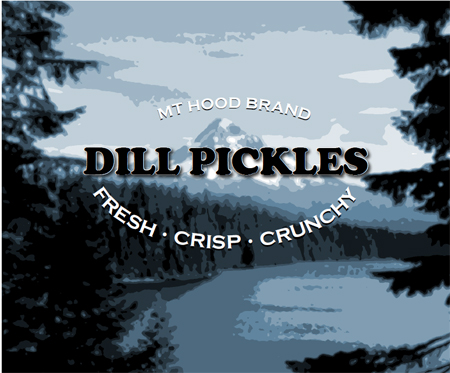
Add your type
To create curved type as I’ve done you have several options. One is to set type on a path in InDesign. Alternately, the same effect could be achieved by creating curved type in Adobe Photoshop or Illustrator. Only experimentation will tell you which method works best.
Finally, save your layout and name it MyLabel.indd. Now close the open window.
Creating the final labels
The last step is to import the label we just created and lay it out on the WL-OL150 template page. From the InDesign File menu, choose New > Document. Create a one page US letter size document with all four margins set to zero.
Again, from the File menu choose Place, and navigate to the World Label WL-OL150 pdf template. Click to place the template so that the edges of the template align with the edges of your page. Open the Layers panel (Window > Layers) and click to lock the template layer. This will prevent it from being selected accidentally.
Click on the Create New Layer icon at the base of the Layers panel to create a new, unlocked, layer. Drag this layer beneath the locked template layer so you can make sure your artwork goes slightly beyond the perimeter of the label wherever possible.
Label layout
With the new layer targeted, go to File > Place and select the InDesign MyLabel. indd file. (Note: placing an InDesign document into another InDesign document only works with InDesign CS3 and above. If you’re working with an older version of InDesign you’ll have to export your label first as a PDF before trying to place it into a new document.) Position the label so it aligns precisely with the upper left area of the template. Once in place, drag the label holding the Alt (Windows) or Option (Mac OS) and Shift keys to copy the first label into the upper right corner.
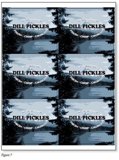
With the top two labels in place, select both and Alt/Option drag another pair downward to the next row. Repeat this process one more time to complete the template (Figure 7).
When it’s time to print, just make sure to hide the locked template layer. Test for alignment by printing first on plain paper. Once you know everything is correctly positioned, replace the plain paper with your World Label labels and start printing!
by Scott Citron, Adobe Certified Expert, InDesign
![]()
Visit Worldlabel.com to check out all our popular size labels

