
![]()
The Alignment tab of a LibreOffice paragraph style has four ways of positioning text on a line: Left, Right, Centered, and Justified. In practice, however, Right is used mostly for highly-formatted documents such as brochures, while Centered is mostly reserved for titles and sub-titles. For body text, the choices are usually Justified, in which the left and right sides of the text column align with both the left and right margins, and Left or “ragged right,” in which only the left side of the text column aligns consistently with a margin. Asked to choose between Justified and Left alignments, most users will choose Justified — but the choice is not as simple as you might think.
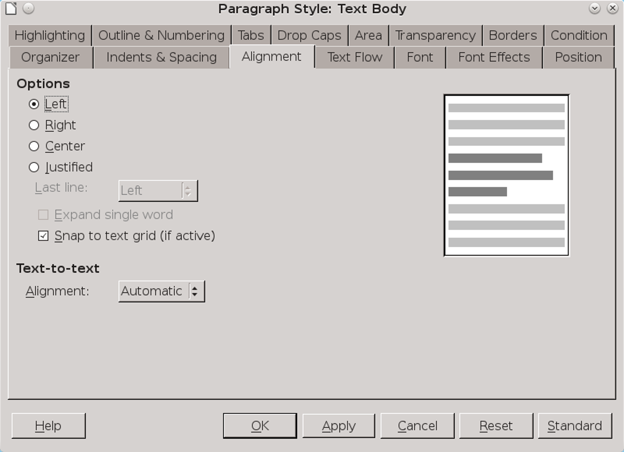
Left vs. Justified Alignment
The preference for a justified alignment dates to the early days of computers. On most typewriters in those days, the only choice was a left alignment. By contrast, a professionally printed page was almost always justified. When the first word processors appeared, suddenly anyone could print a justified page, and, wishing to look professional, that was what most people chose.
The trouble is, a Justified alignment often requires more work to make it look acceptable.
Too often, it results in irregular spacing between characters or words that looks far worse than Left alignment ever could. You almost always need to tinker to find the best distribution of characters and words on a line.
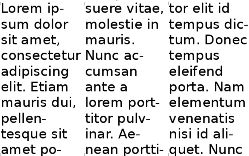
Generally, too, the shorter the line, the harder you have to work to make Justified work. As a rule, lines of less than 40 characters are too much effort to be worth justifying. A Left alignment can have the same problems, but they are often less severe, especially in columns or tables.
The easiest way to tell if a paragraph style can easily use Justified is to set it up with dummy text, and count the number of lines that end in a hyphen, and the blotches of irregular white space.
By contrast, a Left alignment requires less work. A ragged right alignment may not always look as finished as a justified one, but it requires less effort, and is usually good enough for most purposes. In fact, typographical fashion today rebels against justified alignment, and even professional publications sometimes deliberately chooses a left alignment — all of which explains why LibreOffice Writer defaults to a left alignment.
The Last Justified Line
If you do decide to use a justified alignment, one problem you will consistently have is that the last line of justified text is only a complete line by luck. Almost always, it is an incomplete line.
LibreOffice offers several choices of how to handle this problem. Frankly, though, you have to wonder why. The others all leave large gaps between words or letters that anyone who cares about the design of their documents should find unacceptable.
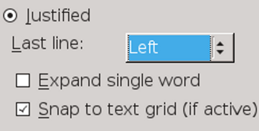
The only consistently aesthetic choice is to set the Last line field to Left. This selection is the only one that eliminates the impossible situation of trying to justify a line of text that is too short and has ugly gaps in it.
The other options, Justified, Centered, Expand single word, and Left, all look awkward. The only reason to use any of them is to provide a sample of why they are unacceptable.
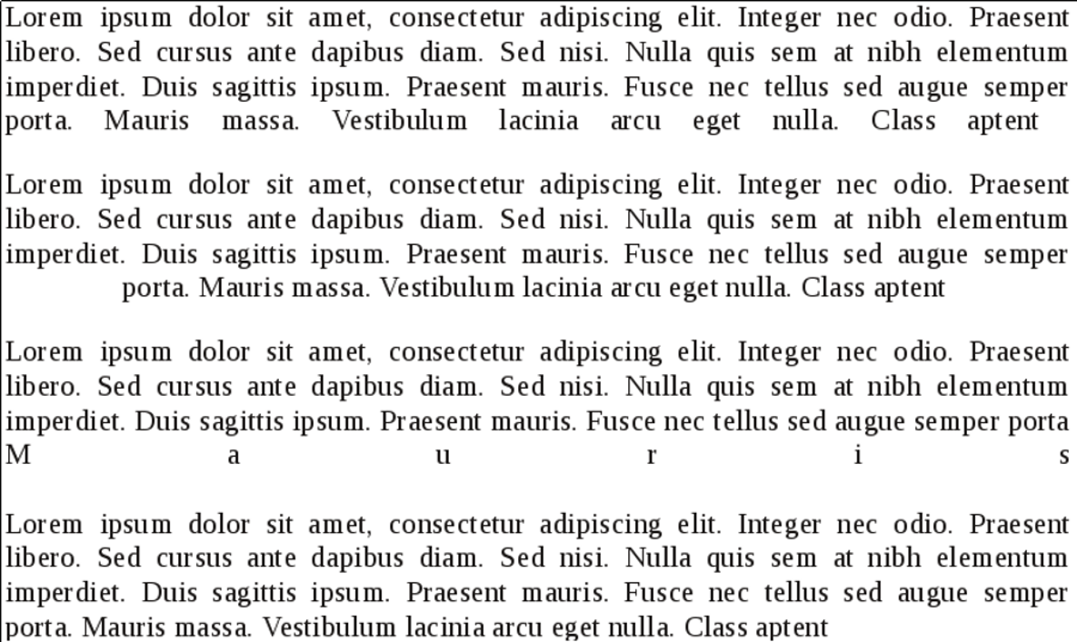
You may be able to improve the look of Justified by selecting Snap to Text Grid (If Active) and adjusting the grid set in Tools > Options > LibreOffice Writer > Grid. However, getting an acceptable look is likely to take a lot of trial and error.
Choosing a left alignment is typically less work than insisting on a justified alignment, especially in columns or tables. However, be aware that any text can have problems, especially if lines are hyphenated or less than forty character lines.
Setting hyphenation
No matter which alignment you choose, its success can depend on whether you choose to hyphenate. Given a normal line length of 55-75 characters, hyphenation can sometimes improve the spacing between words and characters with a justified alignment. However, in a left alignment, whose lines end at different places on the right, allowing hyphens sometimes adds to the clutter. Moreover, no matter what the alignment, the shorter the line, the more hyphenation can be a problem unless you are willing to adjust the settings.
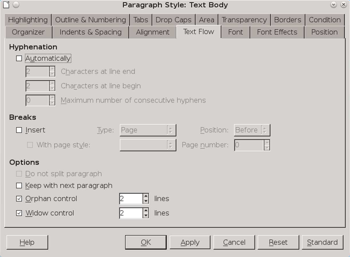
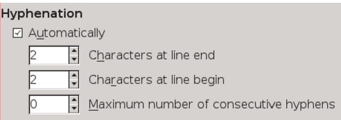
Hyphenation options are set on the Text Flow tab. You can try to improve hyphenation by adjusting the settings on the Text Flow tab. The number of letters at the end and start of the line should be 1–4. Sometimes, the Characters at line end and Characters at line begin fields can sometimes be manipulated to improve hyphenation by playing one off against the other. Working by itself, the Maximum number of consecutive hyphens field can also make a difference. The typographical convention is not to allow more than two lines in a row start with a hyphen, so whatever you can do to eliminate hyphens should be an improvement.
Mercifully, in many documents, only the Text Body paragraph style and perhaps another handful of related styles are used often enough to require adjusting hyphenation. Headings, which are rarely more than a few words long and almost never more than two lines, generally do not need to be hyphenated at all. If anything, headings are easier to scan if not hyphenated.
Tweaking alignment and hyphenation
You may be able to improve your alignment and hyphenation choices by adjusting:
You may want to change the hyphenation by adjusting:
- The Hyphenation settings on the Text Flow tab.
- The font weight or size.
- The choice of fonts.
- The settings for Tools > Options > Language Settings > Writing Aids > Options > Minimal number of characters for hyphenation. These settings are over-ridden by any formatting in the document itself.
- The Scale width and Spacing fields on the Position tab to expand or condense character spacing. Frankly, these fields are a last desperate measure, since they are difficult to use.
In addition, if you do hyphenate, the line divisions can be improved by running Tools > Language > Hyphenation as a final touch on the document. This tool not only works interactively, giving you more control, but also generally does a better job than the on-the-fly hyphenation, if run when the document is complete.
For extra fine-tuning, go through a document when it is complete, and hand-hyphenate by positioning the cursor between syllables and pressing Ctrl+ -. This key combination creates a conditional hyphen that only comes into play when it is in the hyphenation zone near the right margin.
Alignment and hyphenation may seem like simple choices. However, making decisions about them is not as simple as merely imitating what you think professionals designers prefer. Instead, making the best choice is a matter of many other formatting choices. In the end, the right choices are the ones that together make your document easiest to read — and what works for one document may not work for another.
By Bruce Byfield
I have to notice, that this is so easy to follow. Thanks for this
Alignment and hyphenation may seem like simple choices. However, making
decisions about them is not as simple as merely imitating what you think
professionals designers prefer. Instead . درب ضد سرقت
Hi great post!
Can I ask you how to fix the Maximum number of consecutive hyphens, because I can not do it in language settings and every time that I put 1 when I save the file and reopen it It goes back to 0. Impossibile to save either if I set it up properly in Style Format in default settigns style that I use
Sorry I found it out….I was working on RTF and I have to work on ODF or save as ODF