Colour is an important aspect of any design, and the choice of colour is crucial to put across the right message, and stand out from the crowd. Here’s an overview of some of the basics of using colours together, and a rundown of some of the terms used in the world of colour.
Primary Colours
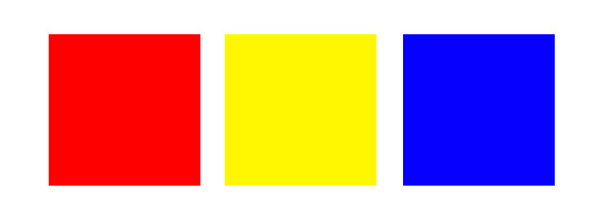
The three primary colours are red, yellow and blue. These are the base colours that every other colour on the colour wheel is produced from.
Secondary Colours
Mix two primary colours together and you’ll get a secondary colour. So, if you mix red and yellow and you’ll get the secondary colour orange. Likewise, yellow and blue will give you the secondary of green.
Tertiary Colours
Mix together a primary and a secondary and you’ll end up with a tertiary colour, and there are countless variations that make up the huge spectrum of colours we see.
Warm and Cool Colours
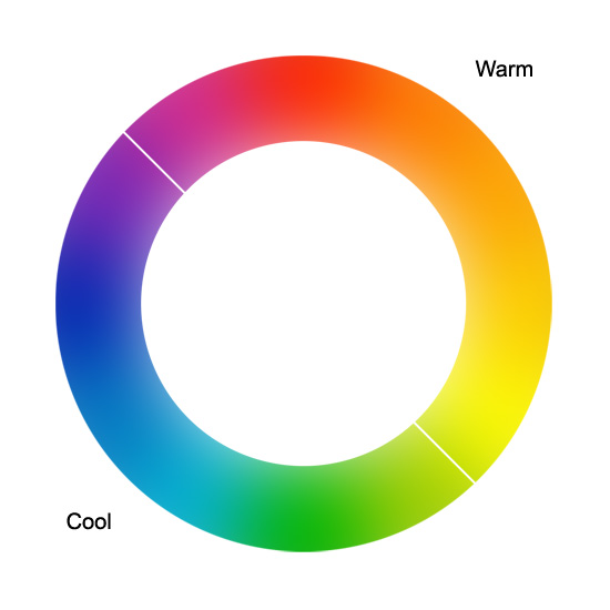
The colour wheel is divided into two halves, warm and cool colours. Generally speaking warm colours are more upbeat and energetic, while cool colours are calmer and more soothing.
Examples of warm colours are orange and yellow. Whereas examples of cool colours are blue and green.
COMBINING COLORS
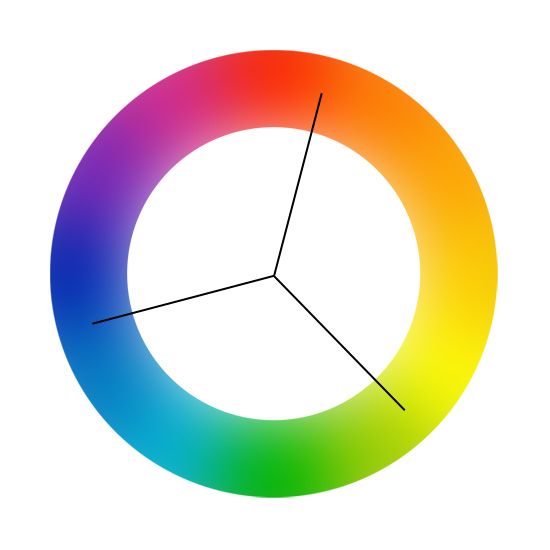
Notice how the three primaries appear in a triangulated position on the colour wheel, with the secondary colours in between. The colour wheel can be a handy tool when developing simple colour schemes.
Complimentary Colours
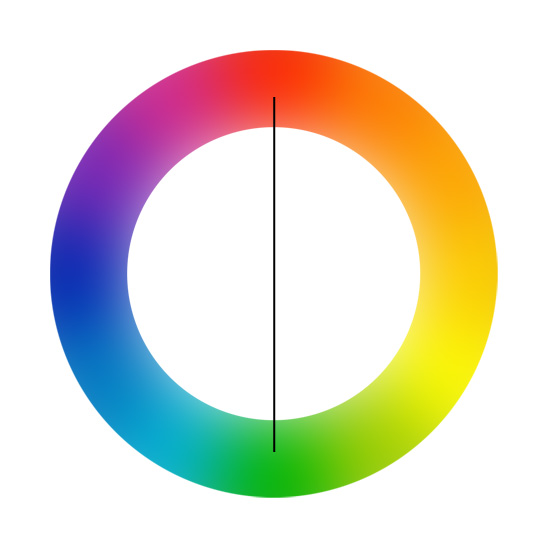
A complimentary colour scheme is a selection of two colours from each end of the wheel, for instance red and green. Despite the word complimentary, they look pretty terrible if used together, as the extremely high contrast produces some garish effects.
Analogous Colours
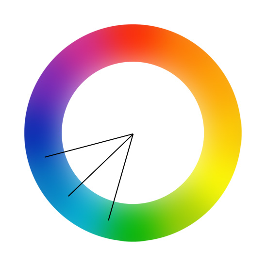
Analogous colours on the other hand, are colours that appear next to each other on the wheel. Taking a colour scheme of analogous colours is a great start to any design, as they harmonize really well.
Triadic Colours
As you might guess, triadic colours take three samples from the colour wheel that are equally spaced. Triadic colours are quite vibrant, and often troublesome to work with due to their high contrast.
Split Complimentary Colours
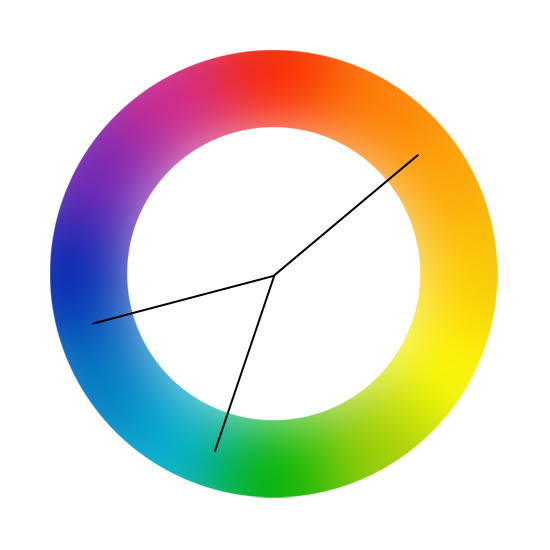
As with complimentary colour schemes, a split complimentary takes samples from opposite ends of the colour wheel, but with the split not being directly adjacent, there’s less contrast and tension.
COLOUR TINTS | SHADES AND TONES
Each colour also has a range of variations depending on its tint, shade or tone. A tint is when white is added to the colour, making it increasingly lighter. Tints can produce bright pastel colours that are easy on the eye.
Shades are when black is added to the colour, and produces darker versions of the colour.
Tones are when grey is mixed with the colour, which takes away the colour value making it more neutral.
COLOR MODES
Depending on the nature of the design you’re working on, you’ll either be working in RGB, CMYK, or even using Pantone Colours.
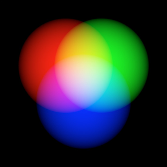
RGB colours are used when the design is viewed on screen, such as a website or computer application. The colours are produced by the mix of red, blue and green lights inside the monitor.
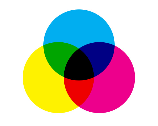
CMYK colour refers to the four inks used in the printing process. Cyan, Magenta, Yellow and black inks are mixed together to form a wide spectrum of colour.
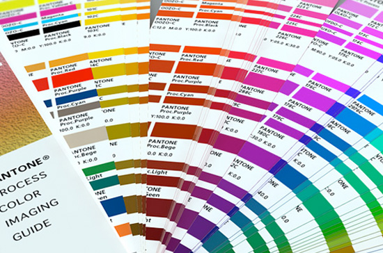
Pantone colours are a collection of pre-mixed colours, unlike CMYK printing, the colour reproduction is exact, and are pure in colour.
We hope this introduction to the basics of colour gives you a head start when producing your upcoming design work!
(Update) And excellent post on the color wheel





i think it is a very good colour which has lots of info
Pingback: Pantone Color Wheel | All Wheels Blog