One of the funnest features of digital image editing is taking pieces of different images and blending them together in a single image, like putting a funny hat on your mom or putting your dog on a jet ski. Or even something serious, like improving a photo of a landscape by adding an element from a different photo. Today we are going to learn how to do this in GIMP, the excellent open source image editing program.
GIMP is not LAME
Computer geeks think they are funny, and that how we end up with names like GIMP and LAME. GIMP is short for GNU Image Manipulation Program. LAME is a recursive acronym for LAME Ain’t an MP3 Encoder. Together they form my mildly amusing subheading. At any rate, whatever the shortcomings of the name, GIMP is an excellent open source painting, drawing, and image editing program. It is free of cost and runs on Linux, Mac, and Windows, and supports a number of drawing tablets like Wacom.
You’ll need a batch of existing images to follow this tutorial– photos, clipart, anything is fine. You can copy images from Web pages by right-clicking on them, and then left-clicking “Save as” in the right-click menu. This is legal for private, personal use; don’t commit copyright infringement by distributing copyrighted images without permission. Visit the Wikimedia Commons to find excellent permissively-licensed images, and you can even share your own.
Saving Your Work
The first and most important lesson is to make a habit of saving your projects as .xcf files. This is the native GIMP file format. You can create composite images out of any mix of image file formats such as JPG, GIF, and PNG. But always save a master file as .xcf because it saves all of your layers and all other editing information, so you can easily re-edit your images. You can export to any image file format you want from .xcf such as JPG, PNG, GIF, BMP…as long as you have that master .xcf file you can do anything you want.
Fun With Layers
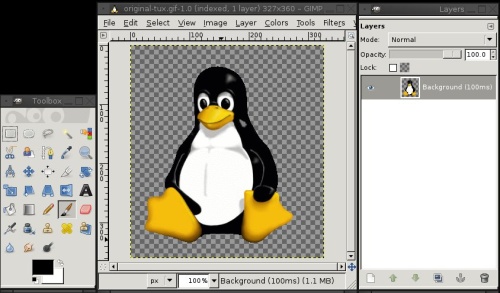
Understanding how to use layers is the #1 most important feature of any higher-end image editor. This is your mighty power tool that gives you fine control over your images. In figure 1 I opened an existing image of Tux, the Linux penguin. Tux was created by Larry Ewing using GIMP. GIMP can take a little getting used to because the toolbars and dialogues are all in separate docks, instead of a single window. You can expose just the ones you want to use and drag them anywhere on your screen. Some users love this, some don’t. (GIMP 2.7.3 includes the long-promised single-window mode option, and will soon be available.)
Figure 1: Tux the Linux penguin in a new GIMP session, with the Toolbox, first image layer, and Layers dialogue.
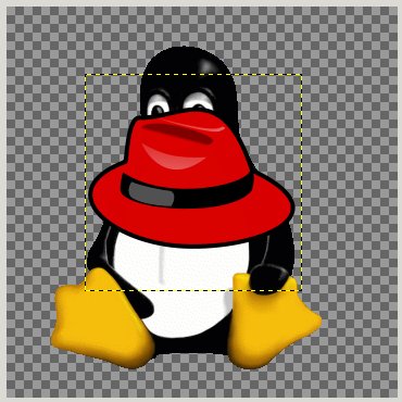
Now let’s put a hat on Tux. I have a red fedora downloaded from Wikimedia Commons, and this image is given to the public domain, so I can do anything I want with it. I want to put it on Tux’s head. The first step is to go to File > Open as layers in Tux’s window (figure 2.)
Figure 2: Hat image opened in a new layer on Tux.
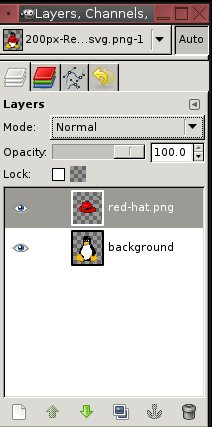
It’s the wrong size and in the wrong place, but that’s OK. It’s in a separate layer so I can edit it just as though it were in a separate window. Note how the Layers dialogue shows two entries now (figure 3). If you don’t see the Layers dialogue, then press Ctrl+l or click Windows > Dockable Dialogs > Layers to open it.
Figure 3: the Layers dialogue displays two layers and several controls.
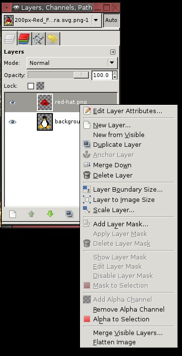
The first image you open will always be labeled “background” in the layers dialog. You can change this name by right-clicking on it, and then left-click Edit Layer Attributes. Note how this right-click menu offers you a whole lot more controls (figure 4). GIMP has a lot of redundant controls, so you’ll see the same ones in multiple locations.
Figure 4: Right-click any item in your Layers dialog to see this menu.
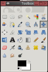
But let’s not get distracted by all these new controls, for we have a hat to edit. Aim your eyeballs to the left and take a look at the Toolbox. This should always open by default (figure 5).
Figure 5: The GIMP Toolbox.
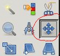
The Toolbox contains a selection of cursor tools. By default it becomes a paintbrush when you pass it over your image. I don’t want a paintbrush, I want the Move tool. That is the little four-pointed dealie. Click on it so you can move objects (figure 6). Remember to always select your tool first.
Figure 6: The Move tool.
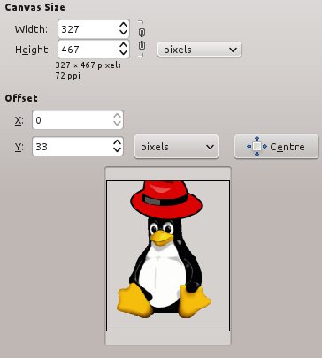
Now I’m going to drag the hat onto Tux’s head. And oops, my canvas is a little too small. Which is no problem, because Image > Canvas Size makes it bigger. A little more height and I have room for the hat (figure 7).
Figure 7: A slightly bigger canvas for more headroom.
Well now, that’s not too bad, except the hat is too big. First I click on the hat layer in the Layer dialog to select it, and then click Layer > Scale Layer in the image window. This opens a dialog for changing the size of the image just in that layer. Note the little chain link between the Width and Height values; when these are linked changes are proportionate. Click the link to un-link the values and control them separately.
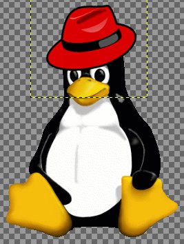
With the hat resized and positioned, I’m still not satisfied because the hat points to the right, and I want it to point to the left. Layer > Transform > Flip Horizontally turns it to the left. A little tweaking the position, and voilà! Tux has a stylin’ hat (figure 8).
Figure 8
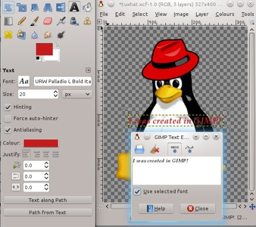
There is one last task, and that is creating a caption. To launch the text editor, go to the Toolbar and click the big A. This also automatically creates a new layer for the text. GIMP has a habit of opening dialogs in inconvenient locations, so drag the text dialog anywhere to get it out of the way. When I type my caption into the text dialog it appears on the image at the same time, and gives a live preview of size, font, and color (figure 9).
Figure 9: Adding a caption.
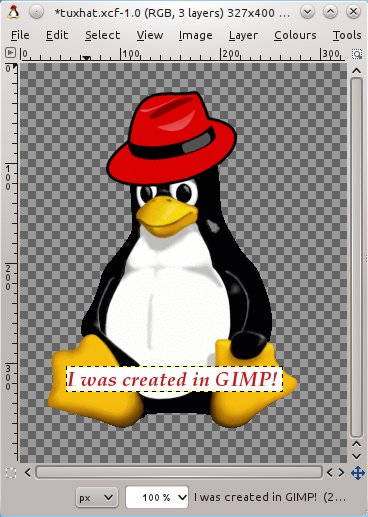
By default layers are transparent, and my text doesn’t show up very well. So one way (there are several ways to do this) to give text a solid background is to click Layer > Transparency > Remove Alpha channel. This results in Figure 10.
Figure 10: Tux now has a hat and caption with a white background.
Now my stylin’ Tux can be saved as any image file format, but don’t forget to always first save your work in .xcf format. Then if you need to make any changes simply select the layer you want to work on. Take a look at the Layers dialog and you’ll see a wealth of useful options: delete, re-order, stack in whatever order you want, duplicate layers, all kinds of modes, and lots more. Which we will explore in future installments. If you like good howto books, Beginning GIMP: From Novice to Professional is the best GIMP book.
By CARLA SCHRODER
Check out this post: Gimp resources to take you from Newbie to Power User

Hey Carla,
I really enjoyed your article. Very informative and I’d bet a donut a lot of fun to do…thanks!
While your tutorial is useful, I would suggest that for the time of work you did in the example, I believe a vector based graphics editor like Inkscape would be better suited.
Resized graphics maintain their appearance and are much easier to align and distribute among the entire image.
Many of the graphics, in fact those almost identical to what you used are available in vector format from http://www.openclipart.org
Pingback: Links 6/1/2012: KDE SC 4.8 is Coming, Tails 0.10 Released | Techrights
I have to say that I disagree with Mark on this one. He is definitely right that making these images in Inkscape (or any other vector-based graphic editor) would be easier, but that’s only the case if they were drawn from scratch.
In this case, both images already existed as .jpg files, so using Gimp was is definitely the easiest way to do this.
I have tried blending text with images in Photoshop but in GIMP yet! Its always seem to me difficult to use GIMP but just started to use it! Will try to blend images in GIMP by following your tutorial.