
![]()
Although I no longer bother to print letterhead or envelopes for my design business (thank you, email!), I’d be lost without a business card. Not only are business cards still traded in the real world, but often it’s the business card itself that helps generate business. Plus, if you’re a graphic designer like me, having a good looking card acts like a mini-portfolio of your skills.
With this in mind, in this tutorial I’ll show how simple it really is to create an effective card that will impress potential clients and help them to remember your name. All this with just a small rectangle of paper. Here goes.
Although business cards often come in many shapes and sizes, for this exercise we’re assuming you want to create a standard U.S. cards measuring 31/2 x 2 inches. Before we get to working with the WL-OL244 template (Download the Template [PDF]), we’ll start by creating one card only. Once we’re happy with the card I’ll show you how to bring it into the eight-up template.
by Scott Citron
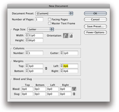
Start by opening any version of Adobe InDesign. From the File menu choose New Document. In the New Document dialog, make your settings match mine below.
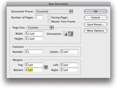
If the measurements I used are confusing or don’t match yours, that’s okay. I’m working in Picas (12 points per pica; 6 picas equal 1 inch), which is InDesign’s default measurement system. Fortunately, you can use any measurement system you want (inches, millimeters, agates). Simply type in the value, remembering to add after the amount i for inches, mm for millimeters, and so on. InDesign will accept the value and translate it to the application default setting.
In my case I typed in 3.5i for the width and 2i for the height. InDesign converted these values to 21p x 12p, which is the same size in Picas. By the way, to avoid this step altogether, just go to the InDesign Preferences and choose Units & Increments. If you do this with no open documents, InDesign will remember your preferences and from now on apply it to all new documents. From here click the OK button to create the document.
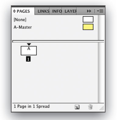
For my card I’ve decided on a gray background, which will lend a cool and sophisticated feel to the design. Because we don’t want to accidentally select the background once we’ve created it, we’ll put in on a Master Page. Items placed on Master Pages are locked by default and can’t be overridden without apply a specific command. From the Pages panel, double click on the A-Master icon.
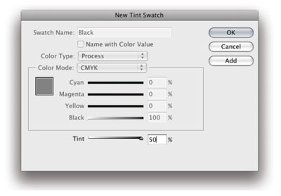
Choose the Rectangle Frame Tool, and draw a rectangle that covers the entire page. Start at the upper left corner and drag down to the lower right corner. With the frame still selected, open the Swatches panel and click on the default Black swatch, which will flood your frame with 100 percent black. With the frame still selected, go to Swatches panel menu in the upper right corner. From the fly-out menu choose New Tint Swatch. Create and add a 50 percent black tint and a 30 percent black tint swatch. Click OK to close the dialog.
Now click the [Black] 50 percent swatch to apply it to the card background. When you’re done, double-click the Page 1 icon in the Pages panel. (Note: this is a very important step. If you forget to return to page 1 all your work will end up on the A-Master page, which, although not fatal, will make you crazy later on. Trust me. I’ve done it many times!)
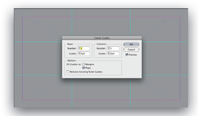
Now that we’re back on page 1, we’ll set up a simple grid that will help organize what comes next. From the Layout menu, choose Create Grid. In this dialog set the number of rows and columns to three. Both gutters (the space between rows or columns) should be zero.
A moment first about the grid. Whether you use grids or not is up to you. Many great works of art were created without grids, but for those learning their way in graphic design, a grid like this is a good practice to follow. When we’re done you’ll see that the design will hew very close to the grid, which will provide continuity and structure to your design. For more information about grids, consult books on photography for the “Rule
of Thirds.” I also cover grids from a historical perspective starting on page 10 of my book, Professional Design Techniques with Adobe Creative Suite 3 (Adobe Press 2008).
The next element will be a large letter C, which will act as a graphic anchor to my design. A key component to good design is the element of contrast and balance. Simply put, a business card where everything is the same size and color is boring. This doesn’t mean you want every element a different color and size (well, you might, but that’s a different story), but by adding some variation your business card will look less passive and more active.
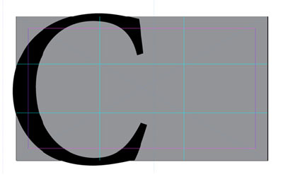
With the Type Tool, draw a large frame on the InDesign pasteboard. With the cursor blinking, type the first letter of your last name. I used uppercase, but you could also try a lowercase initial. Afterward, highlight the initial and change its size to about 225 points. This will probably cause the letter to disappear because it’s too big for its frame.
Type that doesn’t fit in a text frame is know as overset. If this happens to you, simply enlarge the frame with the Selection tool (black arrow) until the letter reappears. Continue using the selection tool to now position the inital cap to your liking. In my case I allowed the cap to bleed slightly off the top, bottom, and left edge of the card. From a design perspective, doing so helps to lead your eye off the page, which counters the boxy quality of working with, and inside of, rectanges.
At this point, experiment with applying different colors to your initial cap. Even though I chose to stay within a black and white theme, I still had trouble deciding whether to make my C black, white, or a shade of gray. For now I went with black.
I also chose Minion Pro Regular for my typeface. Of course, there are tens of thousands of beautiful fonts these days. Because there are so many, choosing the right one is often a difficult task. What’s important in choosing a font, is being sensitive to its personality. Fonts can be serious, playful, conservative, cutting-edge, bashful, or loud. Which
one you choose says a lot about how you see yourself and how you’ll be seen by others.
When in doubt, stick with tried and true fonts that have withstood the test of time. Minion is such a font. Others might be Futura, Bodoni, Baskerville, Univers, Caslon, Garamond, or many more. Like a simple black suit or dress, classical typefaces go with anything.
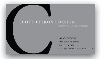
Next up is the rest of the card’s information. Continuing with Minion, I roughed in my address, telephone, and email information. Depending on your card you might want to add your name and title or position. Since my business is my name, I decided not to include my name on the card. See below.
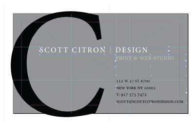
Do you see how both the SCOTT CITRON | DESIGN and 112 W 27th St #700 lines both hang from the two ruler guides we created earlier? Although not intentional, it’s curious how both text blocks just naturally felt more comfortable at those intersections.
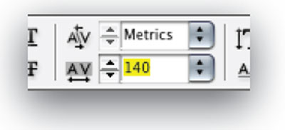
A few additional points worth mentioning. To give my company name a bit more elegance, I applied 140 pts of tracking to the text. This is done by highlighting all three words (SCOTT CITRON DESIGN) and nudging the amount using the keyboard shortcut of Alt/Option + Right Cursor Arrow. Tracking can also be set using the tracking field in the Control Panel, below.
Also, the vertical line (known as the pipe character and found under the delete key on a Macintosh) sat a little low when originally inserted. To bring it up, I highlighted the character and applied a 1 pt baseline shift. Often the at sign (@) in one’s email address sits too high and needs, by the same token, to be baseline shifted downward a touch. Regardless, it’s this kind of attention to detail that separates good typesetting from great typesetting.
Lastly, do you notice how all the numbers on the card look a little different, with many of them hanging below the baseline of the font? These numbers (known technically as figures in typography) are classified as Proportional Old Style. Not all fonts have proportional old style figures, but Minion Pro does. To access these figures, first type them normally. Afterward, highlight the figures (these are, by the way, known as proportional lining figures) and click on the fly-out menu in the InDesign Control Panel. There you’ll see an OpenType submenu.
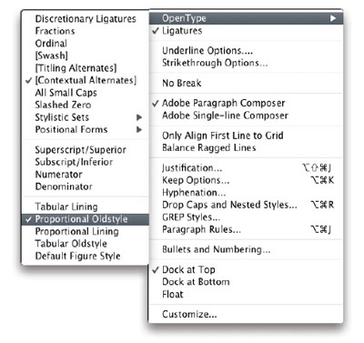
Although I don’t have time to go into detail here about OpenType, suffice it to say that OpenType fonts, particularly those with the word Pro at the end, tend to have extended character sets which often include proportional old style figures.
When you’re done tweaking your type and layout, don’t forget to evaluate it in Preview mode (View > Screen Mode > Preview). Preview mode will hide all invisible guides and frames, allowing you to concentrate on the design itself. Preview also hides anything bleeding off the page edges like, in my case, the big C on the left.
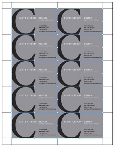
Now that one card is done, laying out eight up on a page using the WL-OL244 template is a breeze. To do so, follow these steps…
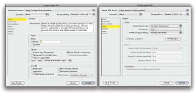
From the File menu choose Adobe PDF Presets > High Quality Print. After choosing where to save your PDF, make your Export to PDF settings match mine.
Assuming your PDF looks right, create a new, letter-size document in InDesign following the settings below.
In the new document, double-click on the A-Master page. Go to File >
Place and navigate to wherever on your computer you’ve stored the eightup template, titled OL244.pdf. Click to place the template on your master page, making sure it lines up properly with your pre-set margins.
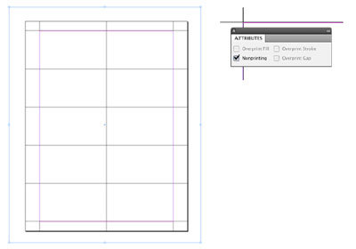
With the template still selected, choose Window > Attributes. In the Attributes panel click to select the Nonprinting checkbox. Doing so will insure that the guide lines act only as a reference, and won’t end up on the final output. As a further confirmation that nonprinting items are in fact nonprinting, notice how these items disappear when viewing your work in Preview mode (View > Screen Mode > Preview).
Next, double-click on page 1 of your Pages panel. By putting the template on the A-Master page you’ve automatically locked it, as well. Now is the time to place the eight cards.
- From the File menu choose Place.
- Navigate to the PDF you created of your single business card.
- Click to place the PDF in the upper left corner of your template grid, making sure the card’s frame is exactly the same size as the card (31/2 x 2 inches).
- Select the card with the black Selection tool. Holding the Alt/Option key, begin to drag the card to the right. As you drag, add a finger to the Shift key to constrain your drag so it goes straight across. Release the card when it snaps into place in the upper right box of the template.
- Click to select the top two cards.
- Again, holding Alt/Option, drag copies of the two cards downward, adding the Shift key as you drag.
- Release the cards when cards 3 and 4 snap into place. You should how have four cards on the page, all touching edge to edge.
- To repeat what you just did, choose Object > Transform Again. You should now have six cards.
- Choose Object > Transform Again one more time. You should now have eight cards on the page, or “eight up.”
Now that all the cards are placed, you’re ready to print. You can either print from this document, or create one more PDF (File > Export > PDF) and print from the eight-up PDF. Either way yields the same results.
My recommendation is to do a test print using normal paper, before printing on the Worldlabel WL-OL244 template stock. This will give you a chance to make sure everything is properly lined up before wasting valuable template stock.
Assuming everything goes well in your test, you should then replace your normal printing paper with the template stock. From there you’re home free!
By Scott Citron of scottcitrondesign.com
At point in “export to pdf” instructions just before placing business card into new A-master, cannot read the screen shots. When I create the new custom file I have no guides. When I place the card there is only 1.
This is very helpful. Please append instructions for a double-sided business card.
Agree w/ previous comment, cannot read the screen shots for exporting to pdf.
Pingback: 60 InDesign-Tipps, die Sie schneller zum Ziel führen | print24 Blog
Pingback: Tutorial Roundup for Getting Started with InDesign
Pingback: Free PSD Designs & Vectors | 30 Design Tutorials For Creating Professional Business Cards
Hello,
Thanks for the tutorial…..however…(lol) Since I am an advid PS user and have actually never worked with ID I got a bit lost……for the beginner in “ID” do you have a tutorial with more screenshots?
I know it is a lot to ask….or perhaps point me in the right direction.
Thanks Again
Pingback: 30 Design Tutorials For Creating Professional Business Cards | Creative Nerds
It’s a pleasure to read this tutorial. It was very helpful
to me.
Pingback: Cool Business Card with Tutorials « Downgraf – Design weblog for designers
this is so cool. k=makes my work so much easier. thanx so much
Pingback: 50 High-Quality Adobe InDesign Tutorials | Web Design Blog
Pingback: Indesign Tutorial | Introduction to Visual Communications