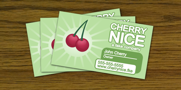
In this tutorial, we’ll be making some very neat business cards using Inkscape. We’ll be starting from a template to keep sizing completely accurate – which also means you can actually print them!
By Aaron Nieze from Shmoggo.com
Setup the Document
Step 1
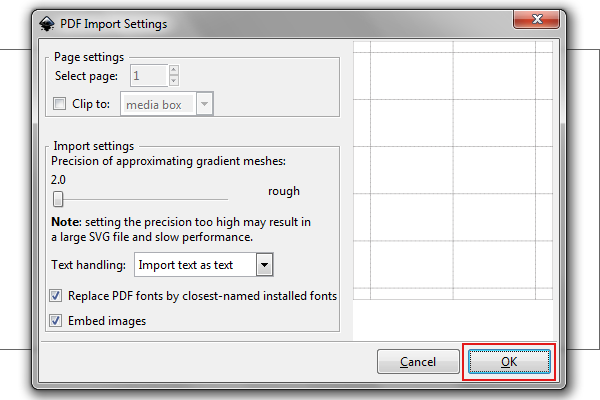
Since we’ll be starting from a template, go to Worldlabel.com and download their business card template WL-244 in PDF. Once that’s downloaded, you can actually open that file straight from Inkscape. It’s a PDF file, so it’ll open up the PDF Import window. The standard settings should be just fine, so just click OK whenever you’re ready.
Step 2
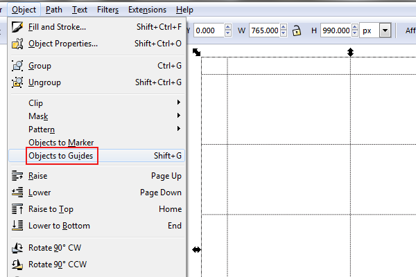
Once that’s opened up, select the series of boxes (it should just be one solid object). With that selected, head up to Object > Objects to Guides.
Step 3
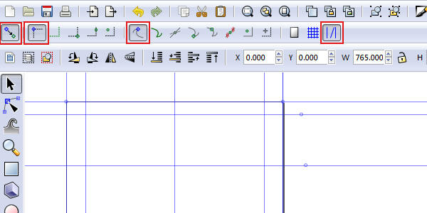
Now we’ve got some guides, but we still need to enable snapping to make use of them. Find your snapping toolbar and enable options as shown below.
Step 4
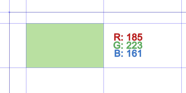
Now, grab the rectangle tool and draw a rectangle inside one of the business cards. Snapping should take over and size it perfectly to the guides. Let’s give it a green color, too.
Drawing a Cherry
Step 1
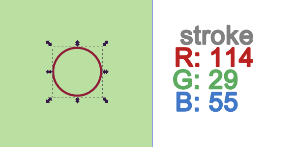
Let’s get the ellipse tool and draw a perfect circle by holding control while dragging. Set the stroke width to 2px and give it a dark red color.
Step 2
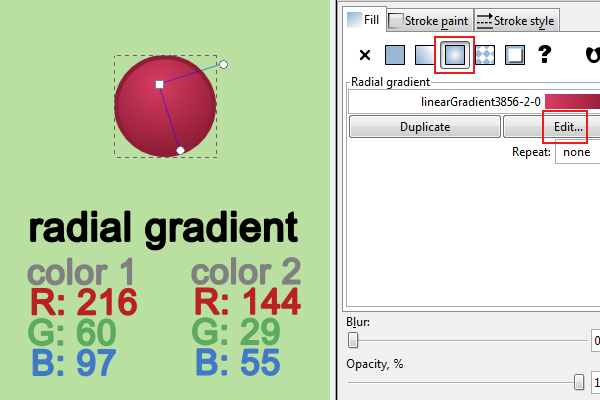
For the fill, we’ll be using a radial gradient. The color stops are shown below, so you can click “Edit” to change the color values of the radial gradient. Afterwards, use the gradient tool to adjust the position as shown below.
Step 3
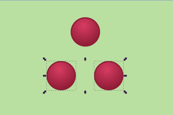
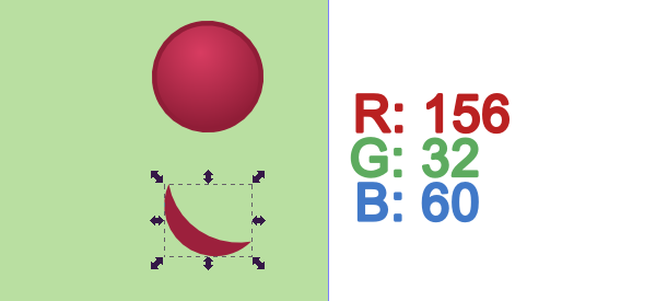
We need to add a shadow now. To do this, we’re going to need 2 more of the same shape in order to get a perfect shadow. So copy and paste 2 of these circles.
Step 4
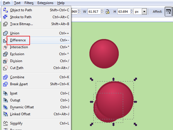
Below, you’ll see I have stretched one of the circles over the other – this will be our cookie cutter cutout of a shadow. Select them both and head up to Path > Difference.
Step 5
You’ll end up with a shape as shown below. Let’s give this a dark red color.
Step 6
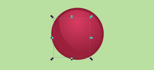
Then, just move the shape to fit inside of the main cherry’s stroke. This will create a nice, subtle shadow.
Step 7
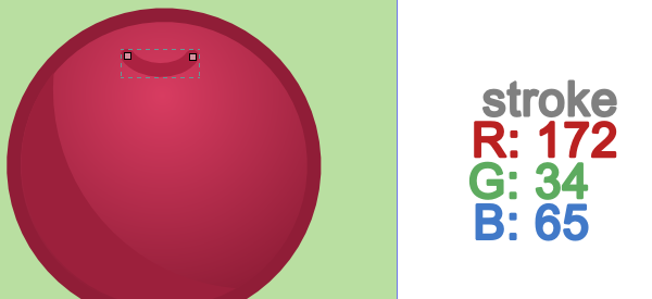
While we’re zoomed in here, let’s add the cherry stem indent. Just grab the pencil tool and draw small swoop line. Set the stroke width to 2px for this as well.
Additional Shading
Step 1
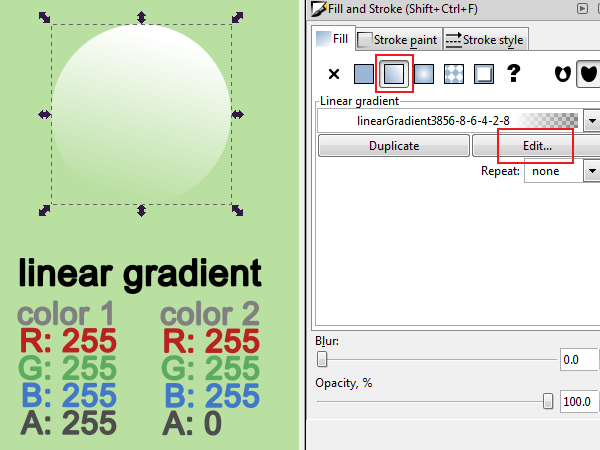
We need to do a highlight to give this cherry some shine! Just make another perfect circle and give it a linear gradient fill. The color stops are shown below.
Step 2
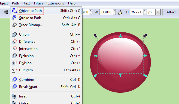
Now, flatten out the circle a bit and position accordingly over the cherry. This will give the cherry some shape and depth. Then, go to Path > Object to Path.
Step 3
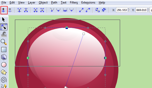
We need to morph this highlight even more. To do this, we need to add more nodes. Select the top 3 nodes of this ellipse and then click “Insert new nodes” from the nodes toolbar.
Step 4
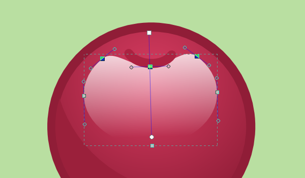
You’ll see we have a couple more nodes. Go ahead and adjust those according to the image below. We’re just trying to wrap this highlight around the stem indent.
Step 5
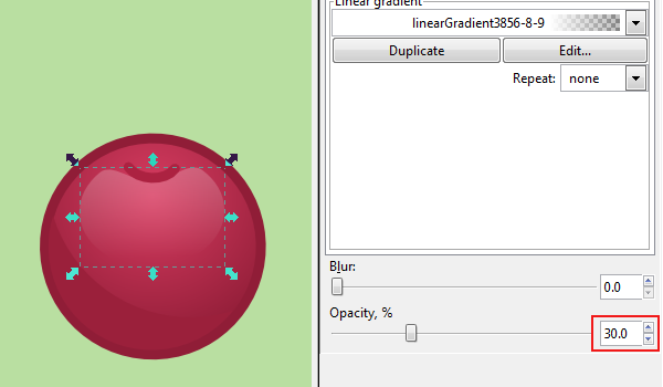
Finally, let’s cut the opacity down to 30.0 to finish up this highlight.
Drawing the Stem
Step 1
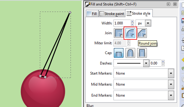
We’re going to use the pen tool to draw a thin, closed triangle on the cherry stem indent. We’ll bend the stem next.
Step 2
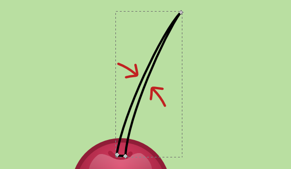
To bend this stem, select the “Edit paths by nodes” tool and click the triangle. With that selected, you can actually grab the center of the lines and drag them to curve them.
Step 3
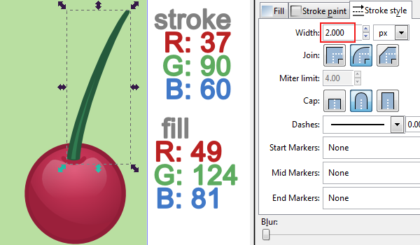
Let’s give this stem a stroke width of 2px. Color the fill green with the stroke as a darker green.
Step 4
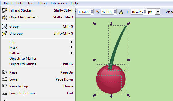
And finally, let’s group this whole cherry together to keep it organized.
Step 5
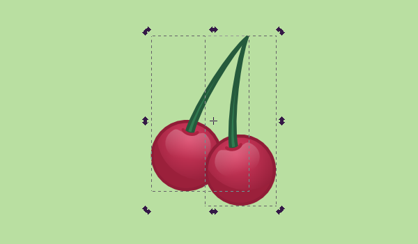
One cherry is boring. Select your cherry to copy and paste. Rotate this one a bit and make sure the top of the stems touch. You can play around with this as a certain position may look better for you.
Incorporating our Cherry
Step 1
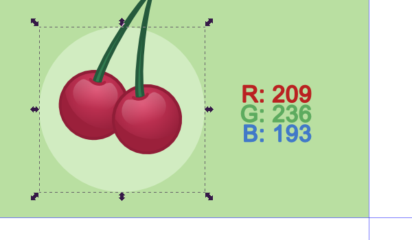
Draw another perfect circle behind the cherries (use Page Down/Page Up to adjust layer position if needed). Color really isn’t important just yet, but let’s just do a light green for now.
Step 2
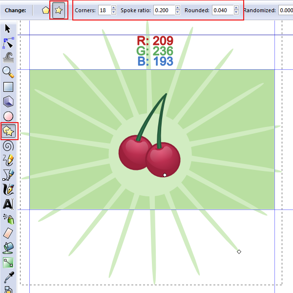
For the burst behind the cherry, we’re going to use the polygon tool. Select the star polygon type and set the setting similar to below. Now go ahead and draw a pretty big polygon behind that circle there.
Step 3
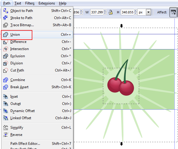
Select both the circle and the star polygon. Then, head up to Path > Union. This will combine the 2 shapes into a single shape.
Step 4
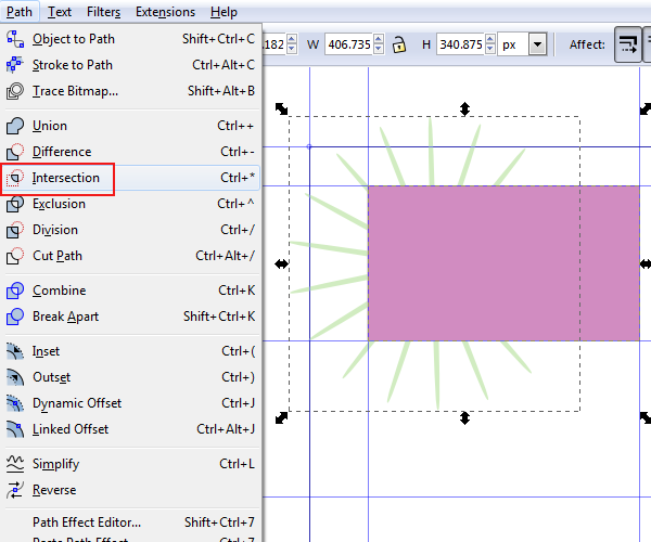
As you can see though, the burst goes completely outside of the business card border. To fix this, draw another square to fit exactly over the business cards (snapping will kick in again). Select both the new square and the burst shape, then click Path > Intersection.
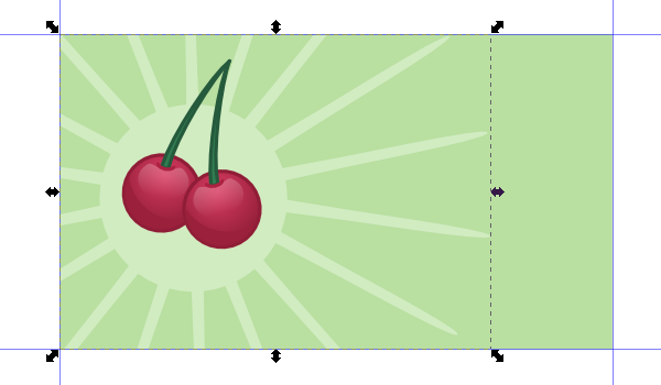
You should end up with something like this. Neat, huh?
Step 5
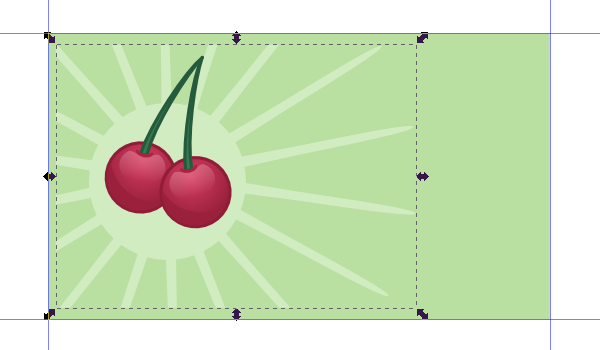
To avoid any bleed issues, let’s select our burst shape and stretch it back from the edges a little.
Step 6
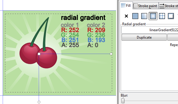
It’s time to color that burst shape. Let’s do a radial gradient with the color stops as shown below. Also, go ahead and grab the gradient tool to adjust the angle as shown below.
Add Some Logo Text
Step 1
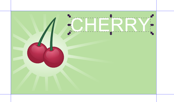
Grab the text tool and type out “CHERRY”. Use a simple font such as Arial.
Step 2
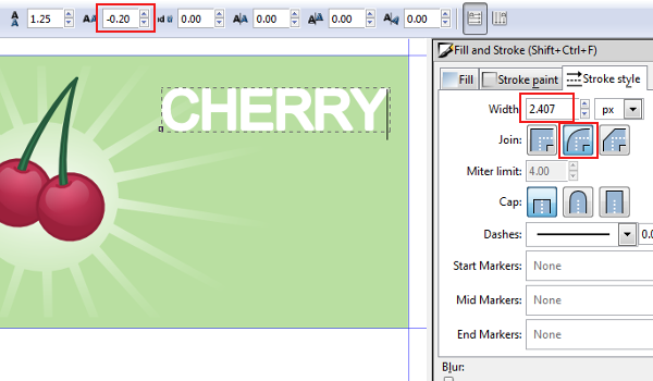
Let’s make some boring text look cool. With your text object selected, go to the text toolbar and lower the text spacing a bit. Also, bulk up the font a bit with some stroke. This gives it a trendy look.
Step 3
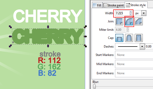
Now, let’s throw a big outline under the text. Just copy and paste the text object, set the stroke to a dark green, and set the stroke width to something like 7px. You’ll be placing this behind the text (Page Up/Page Down for layering positions).
Step 4
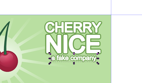
Repeat this process for the next 2 lines of text – size accordingly.
Add Business Card Text
Step 1
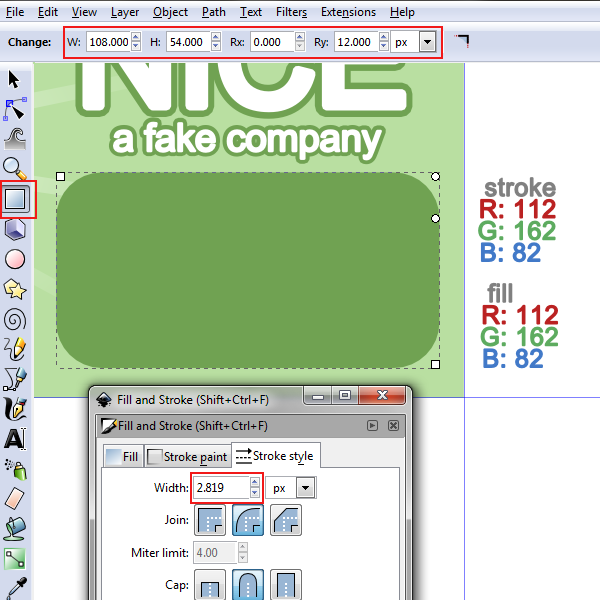
We’re going to draw a rounded rectangle to nest our text in. Take note at the rounded corner dimensions.
Step 2
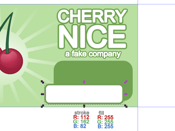
Copy and paste that rectangle and stretch it down a bit to match the one shown below. Also, change the fill to white. Position this new rectangle tastefully offset from the original.
Step 3
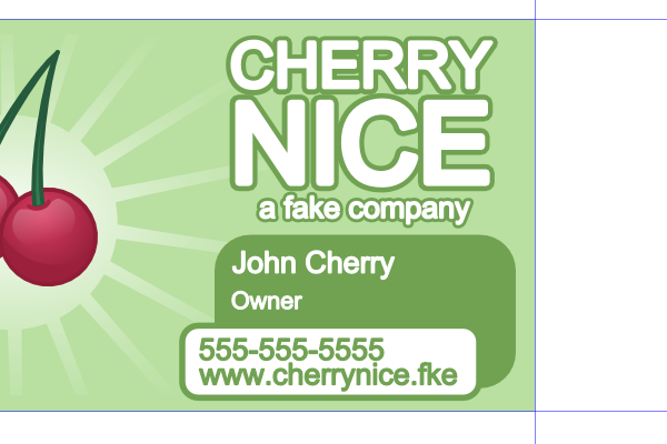
Proceed to add some business card information.
Step 4
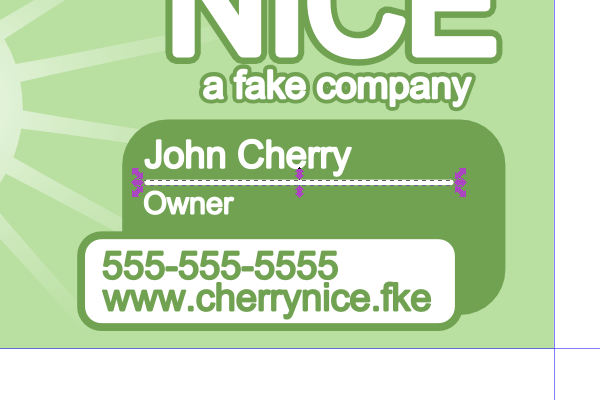
Perhaps throw a little line in there to add some detail.
Finish the Template
Step 1
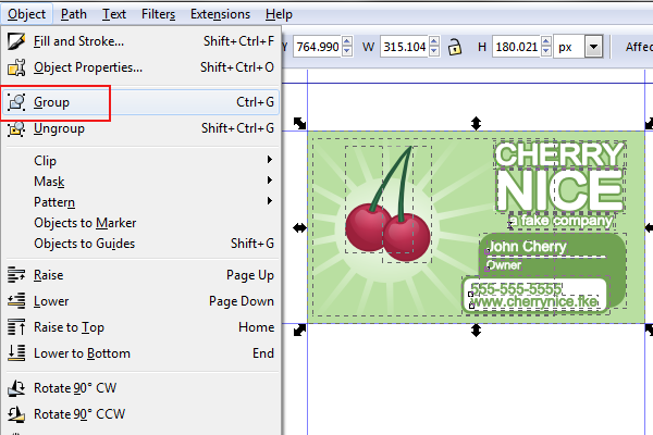
To make the next couple of steps easier, select the entire business card design and Group it.
Step 2
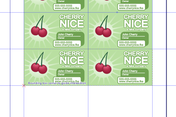
Continue to copy and paste the business card design. Snapping to bounding box corners should be making this painless.
Step 3
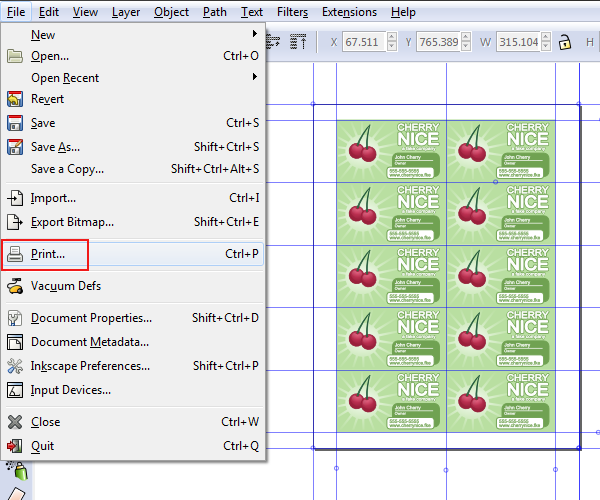
And if you’d like to print these, you can just go up to File > Print. When you go to save this document, save as an SVG file rather than the original PDF.
You’re All Done!
We’ve designed a really neat and trendy business card design using Inkscape. I hope you learned a thing or two in this tutorial, thanks for reading!

