 Scribus is free software page-layout tool applicable to designing all sort of documents: from newspaper ads to fliers to whole books. Because it can precisely position both images and text, it is also the preferred type of tool for designing mailing labels and business cards. A word processor has weaker features for working with pictures and other graphical elements, while a Photoshop-like image editor makes changing text an unnecessary pain. To get started with Scribus, download the latest installer for your operating system.
Designing a sheet of labels is a straightforward process with Scribus: you import the proper template, lay out one label the way you want it, then duplicate your creation to fill the rest of the slots on the template. To get the best results, however, you will need to make use of some specific Scribus features: layers, text styles, and export options.
Start by downloading a template of the label or card sheet you need. Scribus can import EPS and PDF (among other formats); EPS is simpler, so if in doubt, try it first. Within Scribus, create a new document of the appropriate page size (paying particular attention to landscape/portrait orientation). You can set the margin guides to zero for all four sides when creating a new document; you won’t need regular page margins because the template already dictates where the content will go. Once Scribus opens your new blank document, visit the “Page” menu and check the “Snap to Guides” option — this will keep everything orderly when making multiple copies of your layout.
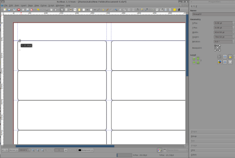
Now choose “File” -> “Import” -> “Get Vector File” from the menu bar. Choose the template you downloaded in the file browser; the mouse cursor will change to a folded-newspaper shape to indicate that wherever you click on the page, the imported file will be placed. Click in the upper-left-hand corner of the page. You are likely to miss the absolute corner by a few pixels; just open up the Properties window from the “Windows” menu. This important palette allows you to view and adjust all sort of content properties in your document. The “X, Y, Z” tab features geometry: you can manually set the X and Y position of the template to 0 for a precise fit.
Next you should add some horizontal and vertical guides to help keep things in position. Create a new guide by clicking in the rulers above and beside the workspace and dragging in to the image. By zooming in, you can very precisely position your guides to exactly fit the label locations of your template. Finally, choose “Windows” -> “Layers” from the menu bar. The Layers window allows you to create and shuffle multiple layers in your document, just as many image editing programs do. The just-imported template is in the default layer “Background;” click on the plus button to add a new layer — in which you will create your content without fear of accidentally bumping the template out of the way.
DESIGN!
Now you can get to work, adding text, lines, shapes, and images to your label design. Text, naturally, is the most important part of the design: if it is not readable, the postal service will not deliver mail, contacts won’t be able to read your phone number, employees won’t know what is stored in what file, and so forth. Nevertheless, Scribus can make your cards or labels look good in addition to being functional.
Let’s start by working with images. Choose “Insert” -> “Insert Image Frame” from the menu bar, or click the “Insert Image Frame” icon on the toolbar. You can click and drag the image frame anywhere on the page. You can grab the side or corner handles on the frame and resize it. Right-click on the frame, and from the context menu choose “Get Image,” then find the image file you want to insert.
Once you have selected your image, look at the Properties panel. In addition to the “X, Y, Z” tab, the “Shape” and “Image” tabs give you some important options. Shape allows you to change the shape of the frame (e.g., rectangular, round, etc.) and set text-flow, so that text content flows automatically around the outside of the image instead of overwriting it. Image gives you more exact control over the size and dimensions of the image display; here you can precisely adjust the positioning of the image within the frame (such as to crop off the top), adjust the horizontal and vertical scaling, and change the DPI setting — an adjustment that will only affect the final output, of course, not the preview that you work with in Scribus itself.
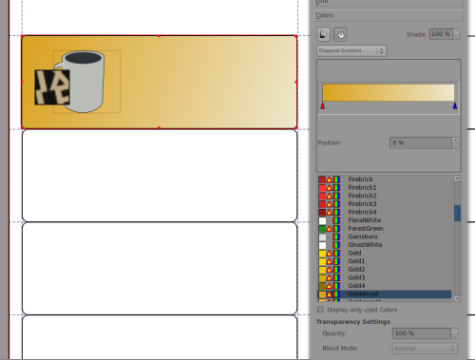
Lines and shapes are just as important as images in many professional designs. You can have Scribus create a wide variety of line styles, and adjust their width, endpoint behavior, and color. Shapes are graphical elements like lines, not layout elements like image frames. The vast majority of the time, you will use shapes to insert solid-color or gradient rectangles, but Scribus can render all sorts of polygons, stars, arrows, and flowchart-like graphics as well.
To make a simple gradient, click on the “Insert Shape” toolbar button, then draw a rectangle on your label. You will notice that it is solid black, unlike the transparency of an empty text or image frame. Here again, you can turn to the Properties palette to adjust the shape to fit your needs. In this case, the “Colors” tab comes into play; from there you can change the line and fill color of the rectangle. The drop-down box allows you to switch between solid color and seven varieties of color gradient.
When you have designed one label to your satisfaction, copy and paste it into all of the other slots of the template. The best thing to do is to select all of the graphical elements at once, then hit Crtl-G to group them together. Thus when you make copies, you can move the copies together without accidentally getting any elements misaligned via a stray mouse click. The guide lines you created earlier will make sure everything is aligned perfectly.
TEXT WITH STYLE(s)
With the background and graphical elements of your design done, create a new layer in which to edit the text elements of your work. Make sure that your text layer is the topmost layer.
For basic text, all you have to do is insert a text frame: choose “Insert” -> “Insert Text Frame” from the menu bar. To edit the contents of the frame, click on the “Edit Text” button or choose “Edit” -> “Edit Text” from the menus. What pops up is the Story Editor, a light-weight word processor that makes it easier to work on the copy inside even if it is to be displayed in a small font or wrapped around some irregular graphics.
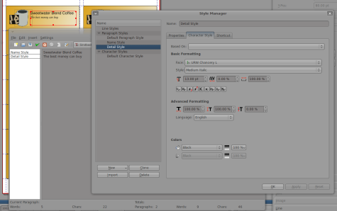
More importantly, the Story Editor allows you to use paragraph styles. You can highlight individual words or phrases and change their typeface, size, and character style in the Story Editor, but for text that you will re-use — as on a sheet of labels or cards — using paragraph styles makes making adjustments far easier.
The left-hand column of the Story Editor is a drop-down menu where you can choose the style of the adjoining paragraph. Left-click on it and choose “Edit Styles” to bring up the Style Manager. If you only plan to use one font element, you can stick with editing the Default Paragraph Style, but if you have a company logo, address, and potentially other text that you want to keep distinct from one another, use the “New” button to create a style for each.
Now, instead of altering the font size, spacing, color, and other details of the text in the Story Editor, change them in the Style Manager, then select the updated style in the drop-down box in the Story Editor. You can quickly see the advantage of this approach if you drag the Style Manager out of the way of the document window and use the “Apply” button to make changes to the selected style: your changes will be updates instantly in the document. Thus you can systematically increase or decrease the font size until it fits, adjust the colors, or test out different type faces, all with a few simple clicks.
It might not seem like a tremendous advantage while you work on a single label, but try this: select all of the text frames, and make duplicates of them for the rest of your sheet. Now you can see how much simpler it is to use styles: change the paragraph style once, and all of the copies are updated.
EXPORT LIKE AN EXPERT
Once your text is in and formatted to your satisfaction, pause and think for a second about printing. When printing a sheet of cards or labels, you don’t want to print the outlines of the PDF or EPS template that you imported in the first step. In some instances you might want to print both the graphics and the text, but in other situations you might not. Return address labels, for example, will all be the same. For other labels you might want to print the graphics all at once (perhaps on the nice, full-color printer), then print one or two labels at a time with different text.
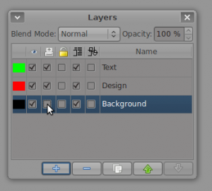
Luckily, because you placed your template, graphics, and text in different layers, Scribus makes it simple to do so. Bring up the Layers window. There are five checkboxes next to each layer in the list, allowing you to individually control whether the layer is shown on screen (helpful for tweaking highly complicated documents), printed, locked or unlocked (to prevent accidental changes), subject to “text flow” around objects from other layers, and displayed in full or in wireframe mode. Uncheck the “Print Layer” box for the templates layer, and the outlines will not be printed. To print a stack of labels with the graphics but no text, uncheck the text layer. Later, you can re-check text and un-check graphics to print addresses without doubling-up on the graphics.
Clearly, if you only want to print a single label, you will have to have more fine-grained control than at the layer level alone. For each object in the document (frame, shape, or even group), you can individually disable or enable printing via the “X, Y, Z” tab in the Properties window. The toggle button depicts a printer, just as it does in the Layers window.
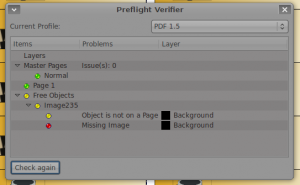
Finally, when you do print from Scribus, you should know about a few of the program’s helpful options: the Preflight Verifier, Collect for Output, and PDF compatibility. The Preflight Verifier is a built-in “sanity check” that scans your document and alerts you if there are any suspicious problems, such as empty image frames, objects that stick out beyond the page, and text that overflows from its text frame. You can always choose to ignore these errors and print anyway, but they are helpful for catching accidents.
Collect for Output (found under the “File” menu) creates a folder for your document and copies all of the graphics and other external sources into that folder so that they remain together. This is especially helpful for working with teams, but it can also be used to make sure that you do not open a document one morning to find that an important logo was deleted from some different folder and you now have no backup.
If you are printing directly to a printer, your output will be handled by PostScript, but Scribus can also export documents as PDFs, with a wide range of options. Specifically, you can choose the amount of image compression, which can affect final output quality, and you can specify font embedding. If you embed the fonts in your document into the PDF, you can be sure of its final printed appearance, but you will increase the size of the file itself, perhaps significantly. Luckily, with PDF you don’t waste any paper, so a little trial and error can help you perfect your design and layout.
By Nathan Willis
Other resources:
gLabels – EZ label creator for Linux
http://oplnk.net/~ajackson/software/maillabels/
Openoffice.org Labels Templates
Printing Avery Labels in Linux
Visit Worldlabel.com for all popular size labels

Cool article! Now how about a tutorial on greeting cards? I use OpenOffice Draw, but there are some limitations to its ability. I have not tried Scribus yet, but will soon.
Thanks,
Dave
Pingback: Destillat KW42-2009 | duetsch.info - GNU/Linux, Open Source, Softwareentwicklung, Selbstmanagement, Vim ...
Just to alert you that I am running Safari 3 on Windows Vista and your header is curiously left aligned. I cleaned my browser cache, nevertheless it doesn’t seem to have any effect. Most certainly a cross-browser css issue.
And on Mandriva 2010.2 with Firefox 3.6.24 it’s hard left also and only using 880px of my1920px
I have read several good stuff here. Certainly worth bookmarking for revisiting. I surprise how much effort you put to make such a magnificent informative web site. aedgcedgagbf